Lighthouse, Inc. Website Redesign
"We are a mission-driven agency, dedicated to improving the overall health of our community through our work with families and children. We affirm that play is the work of childhood and we integrate therapeutic play into many of our services."

Understanding the Problem

Gathering Insights
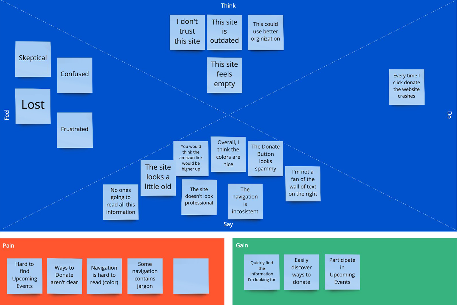
We started by conducting a screening survey designed to find users who might actually benefit (or have benefitted) from using services like those offered by Lighthouse. From those surveyed, we selected seven participants for interviews & usability tests of the existing site.
After reviewing user recordings, my partner and I conducted infinity mapping. Our findings revealed both expected and surprise insights:
- Our users not only need, or have used, these important services, but they are likely to become donors or seek out volunteer opportunities.
- They want support services beyond one-on-one counseling.
- They were confused when taken to a donation site that looked very different from the one they were on.
- The outdated look & feel made users question the organization's validity.

Ideate & Define
User Persona
Competitive Analysis
- Modern designs that were fully responsive
- Strong identity and branding
- Services were front-and-center; easy to find and easy to understand
- Navigation clear and site well-organized
Brainstorm & Prioritize


- Cultivating trust through a more modern design
- Making key information easily accessible through intuitive navigation
- Providing a clear path to donation options and volunteer opportunities
- Giving users a better, overall experience
Next, we completed a card-sorting exercise involving three participants. Those insights were instrumental in helping us develop the new information architecture of the site:


Wireframes & Lo-fi Prototype
With IA in place, we started sketching initial concepts for the site structure. We took the best of both sets and quickly turned our wireframes into a clickable, low-fi InVision prototype, where we were able to work out a few hiccups right away.

Revised Homepage Wireframe

Mid-fi Prototype
We continued to conduct user testing throughout our prototype's evolution. We moved from InVision to AdobeXD to leverage the more powerful, and realistic, prototyping capability.

Visual Design
When it was time to turn our attention to the aesthetics of the site, we went back to what users told us initially: the dated design and styling made the site feel untrustworthy, the lack of images made it feel somewhat cold, and important information all blended together because everything was blue and gray.
We also noticed that Lighthouse had a sister site: An important set of services called, "The TOGETHER Project". This site was newly designed and published, it used a modern architecture, relevant imagery and a nice color palette. But the two didn't look related at all:

Style Guide
We knew that users who managed to find The TOGETHER Project link from the Lighthouse site were confused about their connection because they looked so different. And in some cases, users wondered why it wasn't featured more prominently as they found the services described to be so valuable.
It was clear we needed to unify the identities of Lighthouse, Inc. and The TOGETHER project. We started by cleaning up the Lighthouse logo and changing the colors slightly to complement The TOGETHER Project. Then we used The TOGETHER Project website styles as a guide, and expanded them both into a complete and unified design system:


Et quidem se ipsam per se esse ratione neque quam ob aliquam quaerat voluptatem accusantium doloremque laudantium totam rem voluptas sit amet consectetur


Testimonials


More Case Studies
Let's work together!
I look forward to hearing from you and learning all about your project!
Contact Me