Lighthouse Website Redesign
"We are a mission-driven agency, dedicated to improving the overall health of our community through our work with families and children. We affirm that play is the work of childhood and we integrate therapeutic play into many of our services."

Understanding the Problem

Gathering Insights
Talking to Stakeholders
Despite this project's beginnings as a school assignment, my teammate and I reached out to the organization in hopes of gaining insights directly from their leadership regarding the main objectives and constraints for their website. We did not receive a response, however.
Because of our short timeframe and having a little prior experience with non-profits, we agreed to move forward with some basic assumptions with the idea of circling back to them later:
- Donations are an important revenue stream
- There is probably a limited budget for website design & maintenance
- Community engagement is important
- There is no one regularly maintaining the website
- A Wordpress site was probably chosen for ease of use
Finding our Users
To find our target user group we conducting a screening survey designed to target users who might actually benefit (or have benefitted) from using services similar to those offered by Lighthouse. Additional survey questions helped us learn how our users sought out these services, and the specific types of services:
- 55.6% of all respondents had, or were, participated in counseling or coaching
- 57.1% of all respondents had, or were, participating in group therapy
- Of those who had used the services, 42.8% found them by conducting online searches

Interviews
From our pool of target users, we selected seven participants for interviews & a usability test of the existing site. We asked questions to glean demographic information and learn more about their likes, interests and technology usage.
Then we asked our users to perform specific tasks on the Lighthouse website to serve as a baseline and test some of our early assumptions. Here are a few of those tasks:
- Find information on group counseling
- Make a donation to this organization
- Locate current news or events


Competitive Analysis
- Modern designs that were fully responsive
- Organization's purpose was very clear
- They had a strong identity and consistent branding
- Services were front-and-center, easy to find, and easy to understand
- Navigation was clear and the sites were well-organized
Synthesizing our Data
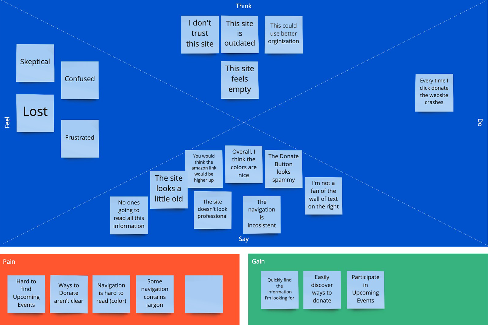
We used several tools to "put it all together" including an affinity diagram and an empathy map. We were also able to further develop our User Personas.
Affinity Diagram

Empathy Map
User Persona

Patricia Davis, 40
Demographics
Lives in a small town right outside of Baltimore. A part-time marketing consultant, she is married and her two kids are in high school. She is active and volunteers in her spare time. She has recently come into the care of her young nephew as her brother is struggling with addiction.
needs
- Needs guidance on how to support her nephew while he is coping with his new living situation and the consequences of his father's addiction.
- Desires to connect with her nephew in new ways to help him feel safe.
- Seeks to find resources to make her newly blended family work.
pain points
- Doesn't know where to start.
- Gets overwhelmed navigating through services that aren't clearly defined.
- Has trouble locating organizations that can help every member of her family adjust and heal.
Validation & Surprise
Through our discovery and interviews, we able to validate some of our early assumptions about website goals and existing problems. Our users also provided some surprise insights:
- Not only are our users consumers of these important services, but they are likely to become donors or seek out volunteer opportunities.
- They want support services beyond one-on-one counseling.
- They were confused when taken to a donation site that looked very different from the one they were on.
- The outdated look & feel made users question the organization's credibility.
Ideate Potential Solutions
Brainstorming & Prioritizing Features


- Cultivating trust through a more modern and thoughtful design
- Making key information, especially services, easily accessible through intuitive navigation
- Providing a clear path to donation options and volunteer opportunities
- Prioritizing news and events to engage the community
- Offering a more aethetically pleasing experience
Information Architecture
Card Sorting
We completed a card-sorting exercise involving three participants. Those insights were instrumental in helping us develop the new information architecture of the site. They also clued us into some potentially confusing acronyms and labels for services.

Sitemap

Wireframes & Lo-fi Prototype
With IA in place, we each started sketching initial concepts for the site structure. We took the best of both sets and quickly turned our wireframes into a clickable, low-fidelity InVision prototype. That alone enabled us to work out a few hiccups right away like a better defined events/news area and a simplified the donation page.

Revised Homepage Wireframe

Mid-fi Prototype
We continued to conduct user testing throughout our prototype's evolution. We moved from InVision to AdobeXD to leverage the more powerful, and realistic, prototyping capability.

Visual Design
First Impressions & New Discoveries
When it was time to turn our attention to the aesthetics of the site, we went back to what users told us initially: the dated design and styling made the site feel untrustworthy, the heavy use of blue and gray felt somewhat cold and obscured important information.
Hidden in the "Upcoming Events" section, we discovered a description of an important set of services called, "The TOGETHER Project". Lighthouse had a sister site!
This site was newly designed and published, it used a modern architecture, relevant imagery and a nice color palette. But the two didn't look related at all:

Design Decisions
Users who managed to find The TOGETHER Project link from the Lighthouse site were confused about their connection because they looked so different. And in some cases, users wondered why it wasn't featured more prominently as they found the services described to be so valuable.
It was clear we needed to unify the identities of the two websites.
We started by taking a good look at the Lighthouse logo. We didn't feel that the logo needed much work, and without a stakeholder's "blessing", we were hesitant to change it. We thought that the logo was likely in use with other collateral and didn't want to erode any established value or trust. Therefore, we decided to "clean up" the logo a bit and modify the colors slightly to complement The TOGETHER Project.
Users searching for services like these are already in stressful situations. We chose meaningful imagery and typography to convey the style adjectives: "Welcoming", "Hopeful", "Helpful". We hoped they would leave the new site feeling better than when they arrived.
Lastly, we let style cues from The TOGETHER Project's website guide as as we expanded them into a complete and unified design system:


User Testing & Outcomes
For prototype testing, we dipped back into our initial pool of users. We were also able to recruit a few more people along the way. We gained great insights and received valuable feedback from 8 desktop users, 3 mobile users, and 2 very detail-oriented TAs:
"Everything seems so crowded and busy"
>Increased the use of white space and broke up large text blocks into more manageable "chunks".
"I didn't really notice the Donate Button at first"
>Changed button color from white/glass style to purple with a gold hover so it would stand out more from the rest of the header links.
"Headers are boring and aren't really standing out"
>Increased header sized for visibility and also changed them to a serif font for interest.
"It would be nice to have clearly defined sections"
>We changed our inconsistent light gray backgrounds to a lavender background complementary to the color palette. We also added a curves that helped us provide even more whitespace between sections and more visual interest.
"The buttons [on mobile] are so small!"
>Scaled our buttons and links to best practice tap area recommended sizes.
A/B Testing
A/B testing was used to help us understand user preferences and work out additional usability issues:


Revisions


Learnings & Next Steps
Being Mindful & Sensitive
Working with a sensitive subject, like mental health or trauma, takes extra time and consideration. I realized this in the beginning as I was drafting our screening questionnaire. In order to get a representative group of users, we had to ask questions about mental health services and history. How would we do this in a way where we wouldn't offend anyone or force them to relive past trauma?
After an external review and several rewrites, we produced a survey that we hoped would be non-triggering and could be taken in complete anonymity on a strictly volunteer basis. That exercise set the tone for the rest of our user encounters and many of our design decisions. We tried to always keep in mind that people who are seeking mental health services for themselves or their loved ones are probably already experiencing distress; We need to make paths to possible solutions simple to navigate.
A/B Testing Rocks!
This was really the first time either of us had employed A/B testing. We were continually surprised at how easy and efficient it was. I'm so happy to have this in my toolkit. I know the phrases, "data-based decisions", "user-informed design" and "cheap & efficient testing" will be music to stakeholder ears.
Bringing Lighthouse to Life
I may reach out to Lighthouse again. I would like a chance to show them what we've put together, and if they are amenable, I would donate my time to produce this website for them.
One Last Note:
Some images of users were changed to protect their privacy.


Testimonials


See More Case Studies


Let's work together!
I look forward to hearing from you and learning all about your project!
Contact Me